Overview
Design a clear, consistent brand identity that helps SAGS look orderly and dependable in the airport environment.
- Brand identity design
- Logo and symbol
- Color and typography system
- Usage guidelines
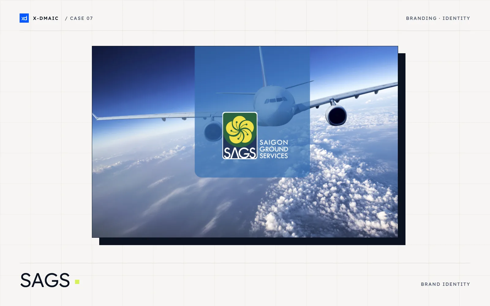
What X-DMAIC did for SAGS? We designed the brand identity for Saigon Ground Services (SAGS), covering the logo, color, typography and usage guidelines. The aim was one clear, consistent image that holds up in the busy airport environment.
Project overview
| Client | Saigon Ground Services (SAGS) |
| Industry | Aviation Services |
| Services | Brand identity design |
The challenge
Saigon Ground Services is a subsidiary of Airports Corporation of Vietnam (ACV) and provides ground services at the airport. Many organizations work side by side there, each with its own signs, colors and logos. In that setting, a brand that is hard to read or used inconsistently can easily blend into the background.
SAGS needed an identity that is quick to recognize, feels orderly and dependable, and is simple enough for the team to use the same way every time.
Our approach
- Logo and symbol: we designed a clean mark that stays readable at a glance and at different sizes.
- Color and typography: we defined a color palette and type system that convey order and reliability.
- Usage guidelines: we set out clear rules on how each element should be used, so the brand stays consistent across materials.
- Built for the airport environment: we checked that the system works together as a whole and suits a busy, fast-moving setting.
What the work delivers
SAGS now has one coherent identity with clear rules behind it. The system helps the company look organized and dependable among the many organizations at the airport. It also gives the team a simple reference when new materials are needed, so the brand can stay consistent over time.
Working on something similar? Book a free consultation or contact us.
Visible, orderly, dependable
SAGS provides ground services at the airport, where passengers and partners meet its team every day. The identity aims to look orderly and dependable in a busy, fast-moving environment.
One clear identity system
X-DMAIC built the identity as a system: a mark, a color palette, typography and simple usage rules. Each element was designed to work together, so the brand reads the same wherever it appears.
Standing out at a busy airport
An airport is full of signs, colors and logos from many organizations. SAGS needed an identity that is easy to recognize at a glance and simple to apply consistently.
Facing a similar challenge in your industry?
Tell us in 60 seconds and we call back during business hours.